Case Study
Yellow Spoon
A Clean Label Brand Making Wholesome Foods Irresistible
Category : Food & Beverages
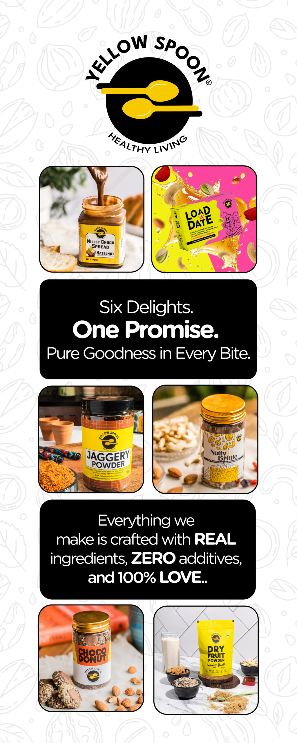
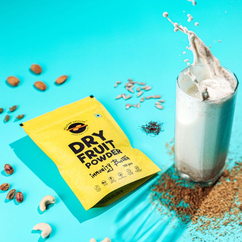
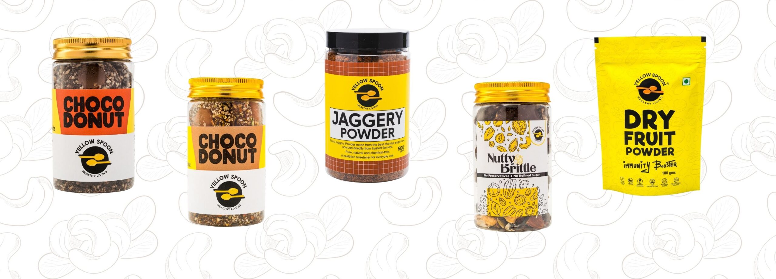
Yellow Spoon is a proudly clean-label food brand dedicated to crafting delicious, preservative-free products with the goodness of jaggery and wholesome ingredients. Their product range, including Millet Choco Spreads (Peanut & Hazelnut), Unsalted Roasted Cashews & Pistachios, and Choco Donuts (Caramel Hazelnut & Caramel Almond), is loved by health-conscious food lovers who refuse to compromise on taste or purity.
Their promise: “Wholesome food for everyone — made with zero preservatives, zero additives, and full of love.”
The Challenge
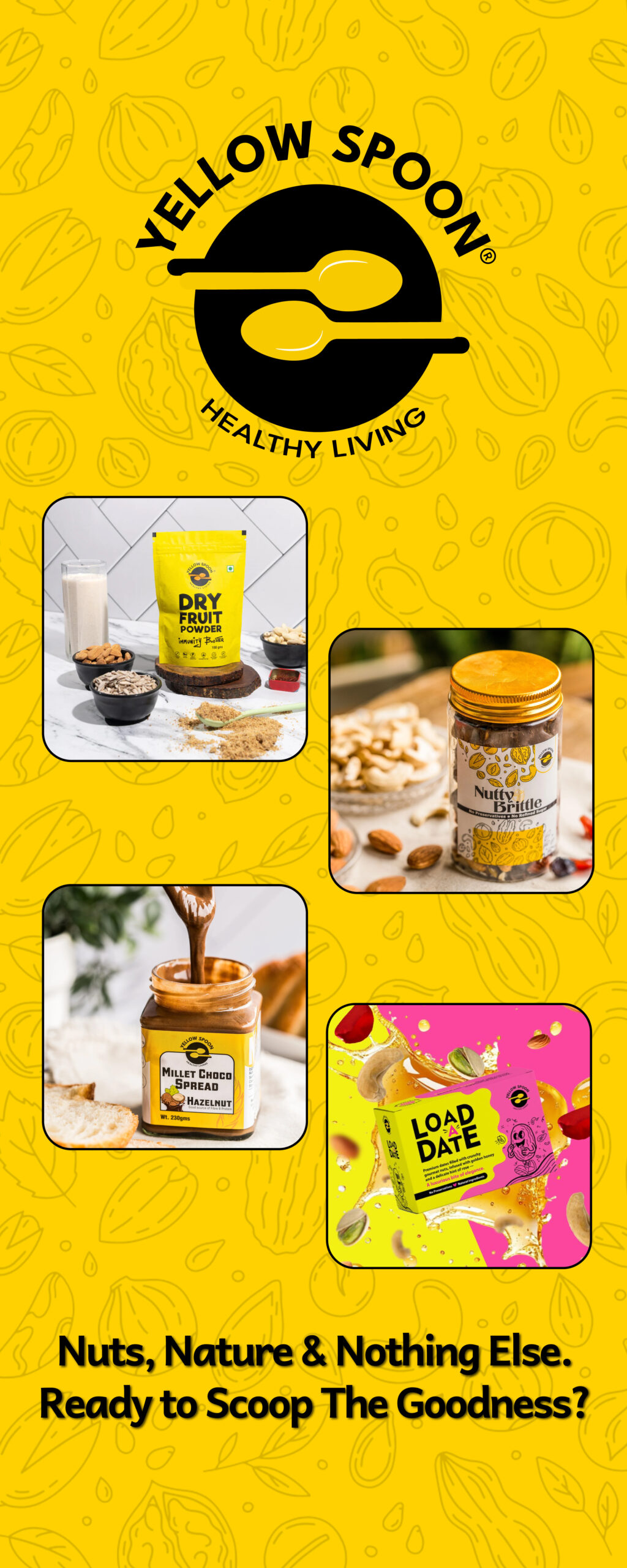
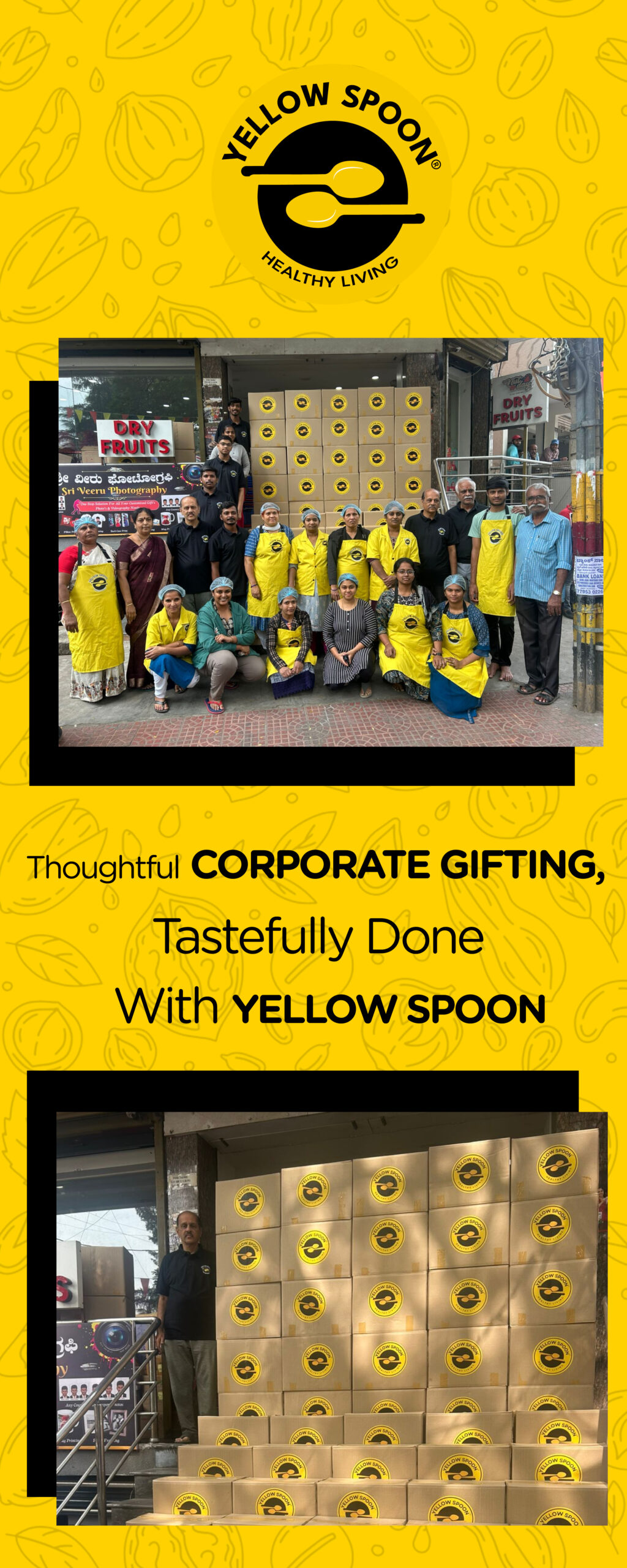
Yellow Spoon was gearing up for a high-profile food event — a golden opportunity to showcase their clean-label promise and irresistible product line. But they needed eye-catching, brand-consistent visual materials that could attract, engage, and communicate their brand values instantly.
The goal was clear: Stand out in a crowded event space and leave an impression strong enough to turn passers-by into loyal customers.
Creative Process
From research to execution, we follow a process that transforms client goals into impactful outcomes.
Yellow Spoon’s clean-label products were unique, but at a crowded food event, they needed branding that was visually striking, trustworthy, and memorable. Our creative process combined design strategy with execution to ensure the brand stood out and connected deeply with the audience.
Time Management
With tight event deadlines, we carefully mapped the delivery of packaging, banners, and standees—ensuring everything was ready ahead of schedule and the client could present with confidence.
User Testing
By gathering feedback on early packaging and event designs, we refined visuals to ensure vibrant imagery tempted the eye (and taste buds) while communicating authenticity.
Market Research
We analyzed food industry trends and competitor branding to highlight Yellow Spoon’s clean-label promise with clear, concise messaging that resonated instantly.
Team Management
Our designers and strategists worked hand-in-hand to keep branding consistent across packaging, colors, and typography, positioning Yellow Spoon as a wholesome lifestyle choice.
The Solution
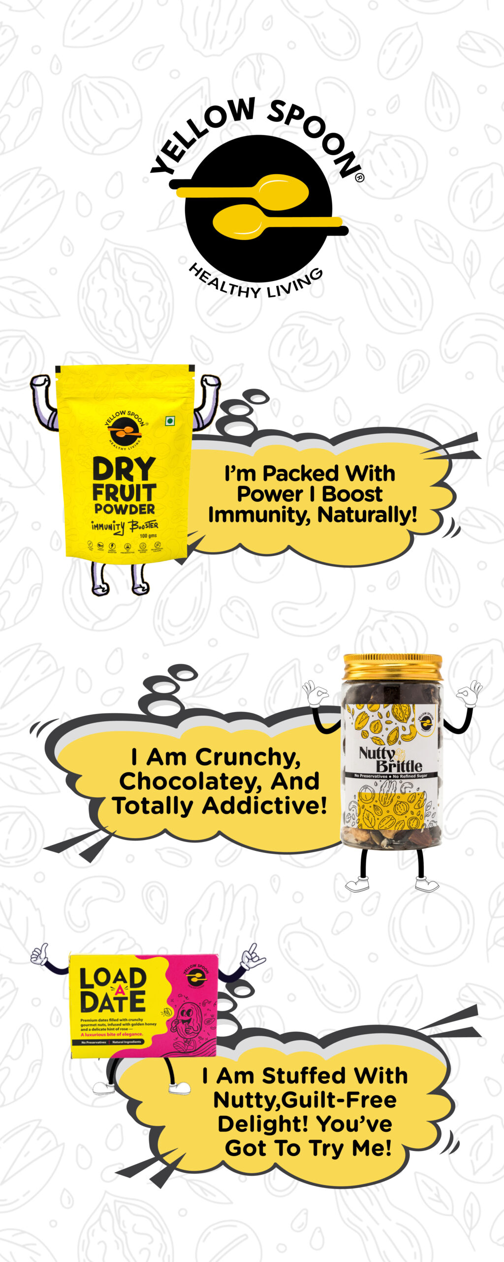
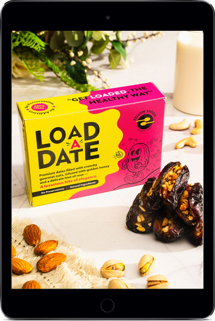
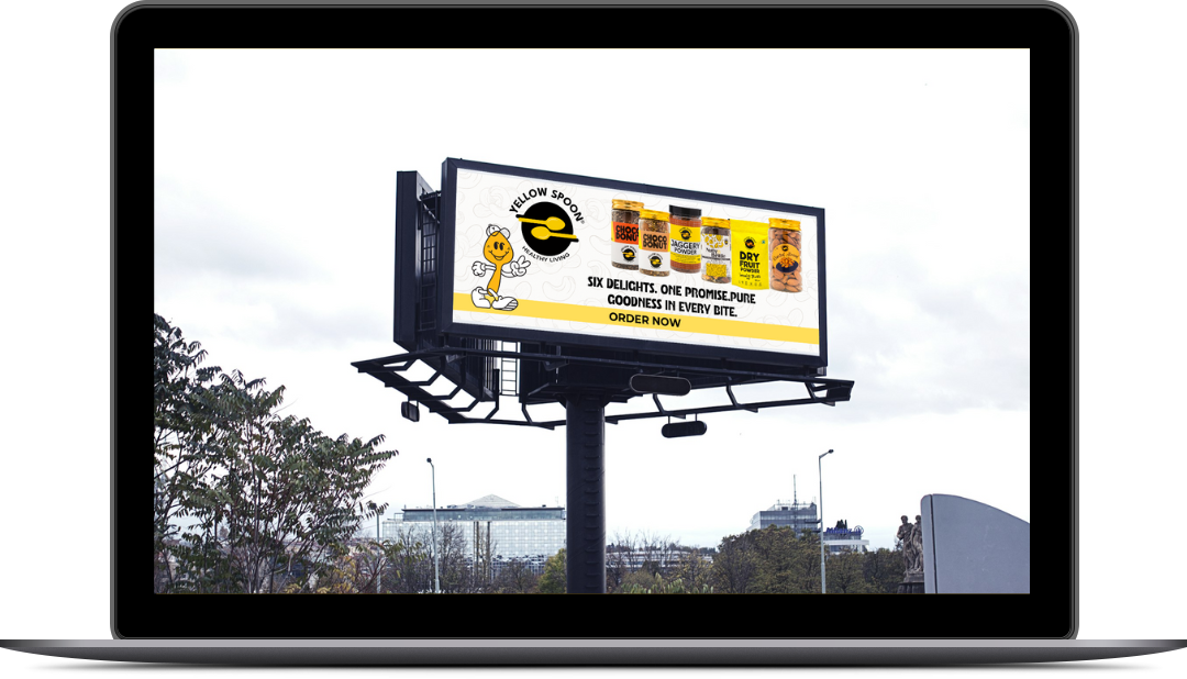
At CharuWriterLance, we understood that Yellow Spoon’s products were truly special—so their branding needed to look as fresh and appealing as the food itself. To achieve this, we created packaging designs, banners, and standees that not only attracted attention at the event but also strengthened brand recall.
Clear Brand Messaging
Highlighted the clean-label promise with concise communication that built immediate trust.
Consistency Across Touchpoints
Maintained brand alignment in colors, typography, and tone, ensuring recall beyond the event.
Lifestyle Positioning
Positioned Yellow Spoon as more than a food brand—framing it as a wholesome lifestyle choice.
Visual Appeal
Showcased vibrant product imagery designed to tempt the eye (and taste buds) instantly.
The Impact
The event became a turning point for Yellow Spoon. With powerful branding and a consistent message, they not only drove remarkable sales but also built meaningful audience connections. The resonance of their clean-label promise extended beyond the event, opening new growth opportunities and strengthening customer loyalty.”
Event Success
Yellow Spoon’s stall became one of the most inviting and visually striking at the event, leading to impressive sales.
Audience Engagement
Striking standees and banners attracted visitors, sparking conversations, tastings, and on-the-spot purchases.
Brand Messaging
The clean-label promise of “wholesome food without preservatives” resonated strongly with the audience.
Post-Event Growth
The event created lasting momentum, with Yellow Spoon reporting interest from potential stockists and repeat customers.


Key Takeaway
When visual branding reflects the soul of the product, it doesn’t just decorate the space — it drives real engagement and conversions. For Yellow Spoon, strategically designed event materials turned their showcase into a sales and brand recall win.
Impact Delivered
Every project we take on is more than just work—it’s a true partnership built on trust and collaboration. Each number you see here represents the journey of clients who believed in us and the measurable impact we created together. From strengthening brands to delivering growth-driven solutions, these results are not just statistics—they are stories of innovation, commitment, and shared success.
- Service Satisfaction – 90%
- Repeat Partnerships – 77%
- Recommendation Score – 85%
Projects
Satisfied Clients
Ongoing Projects
Cups Of Coffee
From Concept to Impact
Discover the projects that define our studio—where bold ideas meet tangible results. Each product, each design, and every campaign showcases our commitment to innovation, creativity, and delivering measurable impact for the brands we work with.
Launch Your Brand to New Heights.
Great branding isn’t about looking different, it’s about being unforgettable. We partner with you to create a brand identity that reflects your vision, inspires trust, and accelerates growth.

